
SEO
How to Improve SEO on Shopify: A Simple Step-by-Step Guide (2026)
A simple, free, step-by-step plan to improve SEO on Shopify — product pages, speed, structure, content, and a realistic 30/60/90-day timeline.

 By Taylor Orlando
·November 7, 2026

Learning how to make a website mobile friendly is one of the best things you can do for your site in 2026. Most people now visit websites on a phone, not a computer — around 59% of all web traffic worldwide came from mobile devices in September 2026, according to StatCounter. And since July 2024, Google looks at the mobile version of your pages first when it decides what to show in search results. If your site is hard to use on a phone, you lose visitors and rankings at the same time.
The good news: you do not need to be a developer to fix this. Most of the steps below take a few minutes each, and many website builders handle the hard parts for you. Work through them in order, and test as you go.
Last updated: November 2026
A mobile-friendly website is one that works well on a phone screen. That means four things:
If your site does all four, it is mobile friendly. If it fails even one, visitors notice — and most of them leave without telling you why.
Three reasons, in plain terms.
First, that is where your visitors are. About six in ten website visits now happen on a phone. If your site only works well on a desktop, you are giving a bad first impression to most of your audience.
Second, Google judges your site by its mobile version. Google finished its move to mobile-first indexing on 5 July 2024. That means Google’s crawler now only uses the smartphone version of your pages. If something is missing or broken on mobile, Google may treat it as missing for good. Google’s own mobile-first indexing guide explains this in detail.
Third, a bad phone experience costs you sales and sign-ups. A visitor who cannot tap the “Buy” button, read the price, or fill in your form will go to a competitor whose site just works. This is not a design nicety — it is a business problem.

Before you change anything, see where you stand. It takes five minutes:
One thing to know: Google’s old Mobile-Friendly Test no longer exists. Google retired it on 1 December 2023, along with the Mobile Usability report in Search Console. PageSpeed Insights and Lighthouse in Chrome are the tools to use now.
Responsive design means one website that reshapes itself for any screen. The layout, images, and text adjust on their own — one column on a phone, more columns on a desktop. Google recommends this approach because one URL and one set of content are easier to crawl and maintain than a separate mobile site (the old “m.example.com” setup).
If you use WordPress, Wix, Squarespace, or Shopify, your theme or template is probably already responsive. Check before you assume: open your site on a phone and look for sideways scrolling. If the theme is not responsive, switching to a responsive theme is the single biggest fix you can make, and it is worth doing before anything else.
The viewport meta tag tells a phone browser how wide your page is and how to scale it. Without it, phones show a shrunken desktop page that visitors have to pinch and zoom.
The tag looks like this:
<meta name="viewport" content="width=device-width, initial-scale=1">
If you use a website builder or a modern WordPress theme, this tag is usually already there. If your site was built by hand or uses a very old theme, ask your developer to add it — or check your theme settings for a “responsive” or “viewport” option.
One warning: never use settings that block zooming, like maximum-scale=1 or user-scalable=no. Some visitors need to zoom to read. Blocking it hurts real people and can hurt your rankings too.
Small text is the most common complaint on phone screens. A few simple rules fix it:
On a phone, a finger is the mouse — and fingers are not precise. Apple’s design guide says tap targets should be at least 44 by 44 pixels. Google’s Material Design guide says 48 by 48 pixels. The WCAG accessibility standard sets a minimum of 24 by 24 pixels, but bigger is better.
Put it into practice:
Big images are the top reason phone pages load slowly. A photo straight from a camera can be several megabytes. On a phone, it should be a fraction of that.
Speed and mobile-friendliness go together. Google measures real-world phone experience through Core Web Vitals, and the most important one for beginners is LCP (Largest Contentful Paint) — how fast the main content appears. Google’s “good” target is 2.5 seconds or less.
Quick wins:
Phone screens are small, so your menu has to be small too. Keep it to five to seven main items. Use a simple “hamburger” menu (the three-line icon) that opens when tapped.
Also think about what phone visitors want most. For a local business, that is usually your phone number, address, and opening hours. A sticky “Call Now” button at the bottom of the screen makes those one tap away. And use click-to-call links (the tel: format) so tapping a phone number actually dials it.
Typing on a phone keyboard is slow, and long forms are the number one reason phone visitors give up. Cut every field you do not truly need. Ask for a name and email — not a life story.
Small touches help a lot:
This one catches a lot of site owners. Because Google now indexes the mobile version of your pages, anything that only exists on the desktop version may as well not exist.
Do not hide important text, images, or videos on mobile to “keep it clean.” Do not strip product details, prices, or FAQs from the phone version. If it matters for your visitors or your rankings, it must be on the mobile version too — even if it sits further down the page.
A pop-up that covers the whole phone screen is one of the fastest ways to lose a visitor. Google also treats intrusive pop-ups as a bad mobile experience.
If you use pop-ups, follow these rules:
Desktop previews lie. A page can look fine in a browser preview and still be broken on a real phone. Before you call the job done:
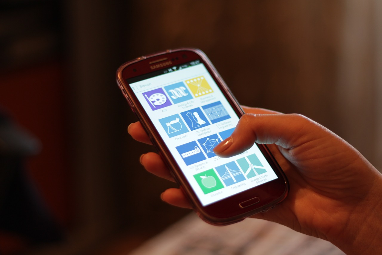
Make this a habit: test on a real phone every time you change your theme, add a plugin, or redesign a page.
If you use one of these, most of the work above is a setting, not a project:
Do these in order. They give the biggest improvement for the least effort:
That is a solid afternoon’s work, and most sites feel very different afterwards.
Open it on a real phone and check three things: the text is readable without zooming, nothing scrolls sideways, and every button is easy to tap. Then run PageSpeed Insights for a mobile score and a list of fixes. Google’s old Mobile-Friendly Test was retired in December 2023, so PageSpeed Insights and Lighthouse are the tools to use now.
A mobile-friendly website works well on a phone. A responsive website is one way to get there — it is a site that reshapes itself for any screen size. A site can be mobile friendly without being fully responsive (for example, a separate mobile version), but responsive design is the approach Google recommends, and it is the simplest to maintain.
Yes. Google uses the mobile version of your pages for indexing and ranking, a system called mobile-first indexing that is now fully in place. A site that works badly on phones can rank lower even for people searching on a desktop. Mobile-friendliness is not the only ranking factor, but it is one of the few you fully control.
Use a responsive theme, make sure the viewport meta tag is present, compress your images, and keep your plugins up to date. Most of the work is theme and image settings, not code. Then test every key page on a real phone and run PageSpeed Insights to catch what is left.
Often nothing. If your theme is already responsive, the fixes in this guide — compressing images, fixing text size, enlarging buttons — are free and take a few hours. If your theme is not responsive, switching to a modern responsive theme is usually free or costs the price of a premium theme (often $30–$60). A full redesign by an agency can cost hundreds or thousands, but most small business sites do not need that.
Making a website mobile friendly is not a one-time project — it is a habit. Phones carry most of your traffic, Google ranks you by your mobile pages, and your visitors judge you in seconds. Start with the 5-minute test, fix the biggest problems first, and check your site on a real phone every time you change something. Your visitors — and your search rankings — will notice the difference.

Taylor Orlando is a content writer at Meregate covering websites, SEO, and AI. Taylor breaks down complex topics into simple, practical guides that help small businesses build better websites, rank higher on Google, and get real value from AI tools — no jargon, no fluff.
A simple, free, step-by-step plan to improve SEO on Shopify — product pages, speed, structure, content, and a realistic 30/60/90-day timeline.

Blogging helps SEO when it is done well. But sloppy blogging — thin posts, overlapping topics, and publishing for the sake of it — can quietly hurt your rankings.

Keyword difficulty tells you how hard it will be to rank for a search term. This guide explains the 0–100 score in plain English, how Ahrefs, Semrush, and Moz work it out, and how to use it when you pick keywords.