Home › Digital Marketing › Landing Page Optimization: 12 Ways to Turn More Visitors Into Customers (2026)
Landing Page Optimization: 12 Ways to Turn More Visitors Into Customers (2026)
By Taylor Orlando·November 16, 2026
Landing page optimization is the work of getting more of your visitors to take the one action your page exists for — buying, signing up, booking a call, or starting a free trial. It is not about getting more traffic. It is about making better use of the traffic you already have. If your page gets 1,000 visitors a month and 20 of them convert, lifting that to 40 doubles your results without spending a dollar more on ads.
Most pages have room to improve. Unbounce studied more than 41,000 landing pages and 464 million visits for its 2024 Conversion Benchmark Report and found the median conversion rate across industries is 6.6%. That means half of all landing pages convert worse than that. WordStream’s broader data puts the median even lower, near 2.35%, with the top 10% of pages converting at 11.45% or higher. The gap between an average page and a good one is large — and most of it comes down to a dozen fixable things.
This guide walks through those 12 fixes in the order that matters most for a small business. Start at the top, fix what applies to your page, and measure the result before you move on.
What is landing page optimization?
A landing page is a page built around a single offer and a single action. A visitor lands on it after clicking an ad, a search result, an email link, or a social post. Landing page optimization means changing the words, layout, form, speed, and trust signals on that page so a bigger share of visitors completes the action.
It is close to conversion rate optimization (CRO), but narrower. CRO covers your whole site — product pages, checkout, pricing pages. Landing page optimization focuses on one page and one job. The work follows a loop: find where the page loses visitors, fix what the data points to, then test the fix before you roll it out for everyone.
12 ways to optimize your landing page
1. Match the page to the ad or link that sent the visitor
This is the highest-leverage fix on most pages, and it costs nothing. If your ad promises “50% off your first order” and the page opens with a generic “Welcome to our store,” the visitor feels lost and leaves. The headline on the page should repeat the promise from the ad in close to the same words.
Go through every ad, email, and link that points to the page. Write down the exact promise and the main phrase from each one. Then rewrite the page headline so it echoes that promise. Keep the same offer, the same price or discount, and the same words for the main benefit. One test published by Unbounce found that changing a headline verb to match the searcher’s keyword lifted conversions by 31.4%.
2. Give the page one job
A landing page should ask for one thing. Not two, not “sign up or browse our blog or follow us on social media.” Every extra button, link, or banner competes with your main action and pulls visitors away from it.
Remove the site navigation if you can, or at least strip it down to a logo. Take out footer links, sidebars, and pop-ups that have nothing to do with the offer. When there is only one clear path forward, more people take it.
3. Write a headline that states the benefit
Eight out of ten visitors read the headline, but only two out of ten read the rest of the page. So the headline has to do the heavy lifting. A good headline says what the visitor gets, who it is for, or what problem it solves — in plain words.
Compare “Welcome to Acme Marketing” with “Get 20% more leads from the traffic you already have.” The first says nothing. The second gives a clear reason to stay. Lead with the outcome or the offer, not your company name. If the headline needs explaining, it is not clear enough yet.
4. Keep the copy simple
Simple copy converts better. Unbounce’s benchmark data shows pages written at a 5th to 7th grade reading level convert at 11.1% — more than twice the 5.3% rate of pages written at a professional level. Hard words and long sentences cost you sales.
Write like you talk. Use short sentences. Cut jargon. Say “free shipping” instead of “complimentary logistics.” If a sentence needs to be read twice, rewrite it. Your visitors are busy, and most of them are reading on a phone.
5. Make the call to action clear and easy to find
The call to action (CTA) is the button or link that asks for the conversion — “Get my free quote,” “Start my free trial,” “Download the guide.” It should be visible without scrolling, and it should be the most eye-catching thing on the page.
Use action words that describe what the visitor gets: Get, Start, Download, Claim, Book. Avoid vague labels like “Submit” or “Click here.” Make the button large enough to tap easily on a phone — at least 44 by 44 pixels — and use a color that stands out from the rest of the page. If the page is long, repeat the button after each main section so visitors never have to scroll back up to act.
6. Shorten the form
Every field you add to a form gives visitors another reason to quit. Ask only for what you truly need to follow up. For a free guide, an email address is often enough. For a quote, name, email, and one or two details about the job may be all you need.
Match the ask to how ready the visitor is. Someone who just found you is not going to fill in ten fields. If you need more information, collect it later — after they have signed up — instead of blocking the first step with a long form.
7. Add trust signals where visitors can see them
People do not buy from a page they do not trust. Trust signals are the small proofs that other people already use and like what you offer: customer reviews, star ratings, logos of clients or publications, a money-back guarantee, or a short testimonial with a real name and photo.
Put the strongest proof near the top of the page, close to the headline and the CTA — not buried at the bottom where few visitors scroll. One or two honest reviews beat a wall of generic praise. If you have numbers, use them: “4.8 out of 5 from 1,200 customers” is more convincing than “customers love us.”
8. Make the page load fast
Speed is a conversion factor, not just a technical detail. In Portent’s analysis of business sites, pages that loaded in 1 second converted at three times the rate of pages that loaded in 5 seconds. A Google-commissioned study by Deloitte found that even a 0.1-second improvement lifted retail conversions by 8.4%.
Google’s Core Web Vitals give you clear targets: the largest part of the page should appear in under 2.5 seconds, the page should respond to taps in under 200 milliseconds, and nothing on the page should shift around while it loads. The usual fixes are compressing images, removing heavy scripts and pop-ups, and cutting third-party widgets you do not need. Test your page with Google’s PageSpeed Insights tool and fix what it flags first.
9. Design for mobile first
Most of your visitors are on a phone. In Unbounce’s data, 83% of landing page visits happened on mobile devices — yet desktop pages still convert about 8% better. That gap is lost money, and it usually comes from pages built for desktop and squeezed onto a small screen.
Build the mobile version first, then adapt it for desktop. Check that the headline fits without wrapping into five lines, the button is easy to tap with a thumb, the form fields are large enough to use, and nothing forces sideways scrolling. Then open the page on a real phone — not just a preview — and try to complete the action yourself.
10. Use images and video that show the offer
People decide fast, and pictures do a lot of that deciding. Show the product in use, the result a customer gets, or a short video that explains the offer in under a minute. A photo of a real customer using your product beats a generic stock photo every time.
Keep images small in file size so they do not slow the page down, and give every image honest alt text that describes what it shows. If you use video, keep it short and let the visitor press play — auto-playing video with sound drives people away.
11. Remove distractions from the page
Every element on the page should either support the offer or get out of the way. That means no unrelated blog links, no social media icons that send visitors off the page, no chat widget popping up before the visitor has read a word, and no second offer competing with the first.
A simple test: look at the page for five seconds, then look away. Can you remember what the offer was and what you were supposed to do? If not, there is too much on the page. Cut the weakest elements first and test again.
12. Test one change at a time
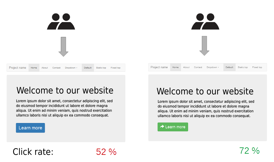
Guessing is not optimization. When you change something, test it against the old version with an A/B test: half your visitors see version A, half see version B, and you keep the winner. Change one thing at a time — a headline, a button, a form length — so you know which change caused the result.
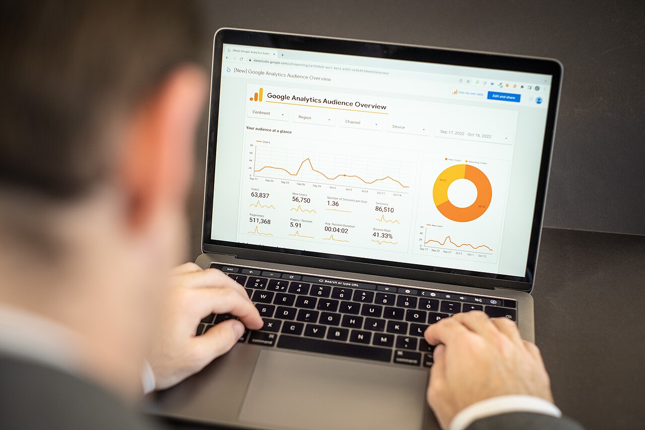
Small sites can still test. Free tools like Google Analytics and Microsoft Clarity show where visitors click, how far they scroll, and where they give up. If your traffic is low, run each test for two to four weeks so the numbers mean something. A test with 50 visitors proves nothing; a test with a few thousand does.
Source: Wikimedia Commons
How to know if your changes worked
Before you change anything, write down your baseline: how many visitors the page gets, how many convert, and what the conversion rate is — split by where the traffic comes from (email, paid search, social) and by device (mobile vs. desktop). Email traffic converts far better than cold social traffic, so a single blended number will mislead you. Unbounce’s data puts email at 19.3% on average, against about 12% for paid social and 10.9% for paid search.
After each change, wait long enough to collect real numbers, then compare like with like. If the rate went up for the same traffic source and device, keep the change. If it went down, roll it back. That is the whole method — no single fix works on every page, and the data will tell you what works on yours.
Source: Wikimedia Commons
Common landing page mistakes
Sending all traffic to the homepage. A homepage has many jobs. A landing page has one. Send each campaign to a page built for that campaign.
Asking for too much too soon. A ten-field form for a free guide kills conversions. Ask for the minimum, then collect the rest later.
Hiding the CTA below the fold. If visitors have to scroll to find the button, many never will. Put it on the first screen.
Using the same page for every audience. A visitor from a “free trial” ad and a visitor from a “pricing” search want different things. Build a page for each.
Never testing. The page you launched is a guess. Without testing, you will never know which parts of the guess were wrong.
Ignoring mobile. If most of your traffic is on phones and the page is built for desktop, you are losing conversions every day.
Frequently asked questions
What is landing page optimization?
Landing page optimization is the process of improving a single landing page — its headline, copy, form, speed, and design — so more visitors complete the action the page exists for, such as buying, signing up, or booking a call.
What is a good landing page conversion rate?
There is no single good number because rates differ by industry and traffic source. As a rough guide, Unbounce’s 2024 benchmark of 41,000 landing pages found a median of 6.6% across industries, with industry medians ranging from 3.8% to 12.3%. Compare your page with others in your industry and traffic source, not with a single headline figure.
How long does landing page optimization take?
The first round of fixes — message match, headline, form, CTA, speed — can be done in a day or two. Testing takes longer: run each A/B test for two to four weeks so the results are reliable. Optimization is ongoing, not a one-time job.
Do I need paid tools to optimize a landing page?
No. Google Analytics is free and shows conversions by source and device. Microsoft Clarity is free and records how visitors scroll and click. Google’s PageSpeed Insights is free and flags speed problems. Paid A/B testing tools help at higher traffic levels, but they are not required to start.
What is the difference between landing page optimization and CRO?
Conversion rate optimization (CRO) covers your whole website — product pages, checkout, pricing, and more. Landing page optimization is the narrower job of improving one landing page and one offer. The methods are the same: find the leak, fix it, test the fix.
The bottom line
Landing page optimization is not about tricks or a perfect design. It is about matching the page to the promise that brought the visitor, saying the benefit in plain words, asking for one clear action, removing friction, and testing what you change. Start with the fixes at the top of this list — message match, one job, a clear headline — because they cost nothing and usually move the number most. Then measure, test, and keep the changes that work. The traffic you already have is worth more than you think.
Taylor Orlando is a content writer at Meregate covering websites, SEO, and AI. Taylor breaks down complex topics into simple, practical guides that help small businesses build better websites, rank higher on Google, and get real value from AI tools — no jargon, no fluff.
A free Google Business Profile puts your small business on Google Search and Maps. Follow this simple step-by-step guide to set it up, verify it, and finish it properly.
Defense buyers search online before they ever talk to a supplier. This guide shows how SEO, PPC, LinkedIn, and honest content help defense companies get seen by the right decision-makers.
White label digital marketing is when a specialist partner does the work and your agency sells it under your own brand. Here is how it works, what you can resell, what it costs, and how to pick a good partner.