
Tech
What Is a Favicon? Meaning, Sizes & How to Add One
A favicon is the small icon that shows up next to your site name in a browser tab. This guide explains what it is, which size and format to use, and how to add one to WordPress.

 By Taylor Orlando
·November 15, 2026
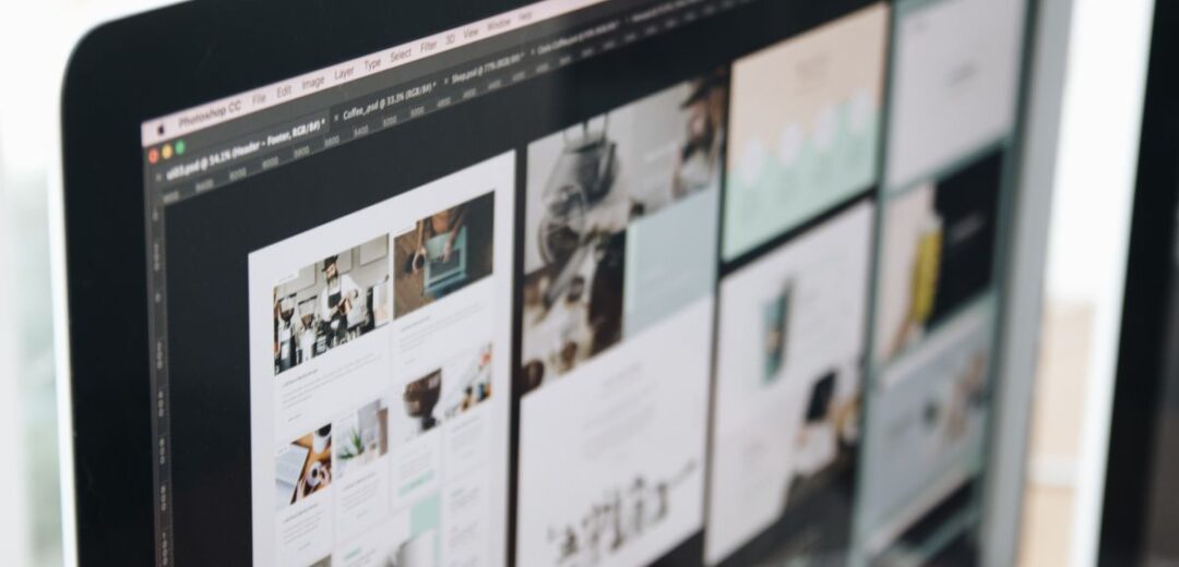
Web design trends 2026 are less about flashy effects and more about warmth, clarity, and speed. After years of clean, look-alike templates, sites this year feel more human: bigger type, warmer colors, real photos, and small touches that make a page feel made by a person, not a machine. At the same time, Google and AI search tools reward fast, clear, well-structured pages more than ever. This guide covers 12 web design trends for 2026 that a small business can actually use, what each one costs in time and money, which trends to skip, and how to add them in WordPress or Wix without hiring a designer.
Last updated: November 2026
Use this table to pick fast. “Effort” means what it takes for a small business owner to add the trend to an existing site.
| Trend | Effort | Best for | Watch out for |
|---|---|---|---|
| Bento grids | Low | Services, portfolios, product features | Too many tiles looks messy |
| Bold, oversized type | Low | Almost any business | Keep it to headlines only |
| Warm, nature-inspired color | Low | Wellness, food, local shops, B2B | Low contrast hurts reading |
| Retro and Y2K touches | Low | Fashion, music, food, youth brands | Dates fast; avoid for banks, law, health |
| Micro-interactions | Low to medium | Online stores, booking sites | Too much motion slows the page |
| Dark mode | Medium | Apps, media, tech products | Needs a full second color set |
| Handmade, imperfect details | Low | Creatives, cafes, craft brands | Can look sloppy if overdone |
| Anti-grid, organic layouts | Medium | Portfolios, agencies, studios | Hard to keep tidy on mobile |
| AI personalization | Medium | Stores, SaaS, content sites | Privacy rules; needs real data |
| 3D and immersive visuals | High | Product showcases, real estate | Slow load times, high cost |
| Accessibility-first design | Low to medium | Every business | None — it helps everyone |
| Performance-first design | Low to medium | Every business | None — speed is a ranking factor |
A bento grid is a set of boxes in different sizes, named after the Japanese lunchbox. The biggest box holds your main message or best feature, and smaller boxes hold the rest: a photo, a review, a stat, a link. It is the most useful layout trend of 2026 because it fixes the most common small-business problem: a homepage that lists everything in one long, boring column.
Best for: service businesses, portfolios, online stores with a few key products, and software sites. GoDaddy lists bento blocks as a fit for fitness, fashion, food, home decor, retail, education, and tech.
How to add it: In WordPress, most block themes and page builders (including the free block editor) now have grid or columns blocks you can resize. In Wix, use a grid layout section and drag the boxes to different sizes. Keep it to 6 to 9 boxes at most. More than that, and visitors stop reading.
Watch out: Boxes with different heights can break on small phones. Check the grid on a real phone, not just in the editor preview.
Big type is doing more work in 2026. Instead of a small headline over a stock photo, sites now lead with one huge line of text that says what the business does. Figma, Wix, and GoDaddy all list it as a top trend, and it works because visitors decide in seconds whether to stay. A clear, giant headline answers their first question at once: “Am I in the right place?”
Best for: almost any business. It is the cheapest trend on this list.
How to add it: Pick one font for headlines and one for body text, and no more. Set your main headline to roughly 2 to 3 times your body size. In WordPress, your theme’s font settings do this; in Wix, use the text theme settings. Use short headlines — 5 to 8 words work best.
Watch out: Big type only works with real words. “Welcome to our website” in 80-point type is still a wasted headline. Say what you do and who it is for.
The cold, grey, “tech startup” look is fading. In its place, 2026 sites use warm, earthy tones: soft greens, clay, cream, wood browns, and muted skin tones. Pantone’s Color of the Year for 2026 is Cloud Dancer, a soft white that fits this shift. Wix calls the trend “nature distilled,” and the idea is simple: warm colors feel calm and human, and they make a small business feel friendly instead of corporate.
Best for: wellness, food, cafes, local shops, skincare, and B2B brands that want to feel warmer. It also suits coaches, therapists, and anyone selling trust.
How to add it: Change your site’s color palette in your theme or builder settings. Pick one warm main color, one dark color for text, and one light neutral for backgrounds. Free tools like Coolors can build a palette in minutes.
Watch out: Warm, pale colors can make text hard to read. Test every color pair for contrast — dark text on a light background is still the safest choice for body copy.
Retro is the loudest visual trend of 2026. Wix lists five retro trends in one article — retro revival, dial-up design, ’80s excess, retrofuture femme, and museumcore — and Figma and Behance agree. Think chunky pixel fonts, bright 90s colors, old-computer references, sticker-style graphics, and layouts that look a little rough on purpose. It works because it stands out in a feed full of clean, identical templates.
Best for: fashion, music, food, events, streetwear, and any brand aimed at people under 35. VistaPrint notes that dial-up style suits music and fashion brands in particular.
How to add it: Use it as an accent, not a full redesign: a retro font for headlines, a sticker-style badge, or a 90s-style section on a campaign page. In Wix and WordPress, retro fonts are free in Google Fonts — try “DM Serif Display” for a vintage feel or “Space Grotesk” for a techy 90s look.
Watch out: Retro dates fast, and it kills trust in serious fields. Do not use it for a law firm, a bank, a medical clinic, or a B2B software site. If your customers need to trust you with money or health, skip this one.
Micro-interactions are the small animations that respond to what a visitor does: a button that lifts when you hover, a heart that fills when you save an item, a progress bar on a form, a gentle fade as you scroll. Used with restraint, they make a site feel alive and guide the eye to the next step. Used too much, they slow the page and annoy people.
Best for: online stores, booking sites, and forms. A small animation on the “add to cart” or “book now” button is worth more than a fancy scrolling effect.
How to add it: Most WordPress themes and Wix sites already include hover effects and scroll fades — turn on one or two, not ten. In WordPress, free plugins can add button hover effects without code. Keep every animation under half a second.
Watch out: Motion costs speed. Autoplay video, heavy scroll effects, and parallax backgrounds are the top causes of slow pages. Google’s own data says 53% of mobile visitors leave a page that takes longer than 3 seconds to load, and a 1-second delay can cut mobile conversions by up to 20%. Test your page speed after adding any motion. The free PageSpeed Insights tool from Google shows what is slowing your page down.
Dark mode — light text on a dark background — has moved from an app feature to a standard site option. Figma lists it as a 2026 trend, and most visitors now expect a toggle on content-heavy sites. It suits media, tech, and creative brands, and it is easier on the eyes at night.
Best for: blogs, media sites, apps, tech products, and portfolios.
How to add it: This is the one trend that is not a quick job. A proper dark mode needs a full second color set: dark backgrounds, light text, and adjusted images and buttons. In WordPress, plugins like WP Dark Mode add a toggle for free. In Wix, dark mode is a manual job — you rebuild sections with dark colors.
Watch out: A half-done dark mode is worse than none: white boxes, unreadable buttons, and images with white backgrounds sticking out. If you cannot test every page in dark mode, skip it.
As AI-made images and text fill the web, the handmade look is becoming a selling point. VistaPrint calls it “human scribble” — hand-drawn arrows, underlines, doodles, and slightly uneven lettering. Behance’s 2026 trends talk about “anti-polish” and raw authenticity. The message is: a real person made this. For a small business, that is a real advantage over a big brand’s polished template.
Best for: creatives, cafes, craft and handmade brands, coaches, and local shops.
How to add it: One or two hand-drawn touches are enough: a hand-written font for a short note, a drawn arrow pointing to your main button, or a real photo of your workspace instead of a stock photo. Canva has free hand-drawn elements you can add in minutes.
Watch out: Imperfect is a style, not an excuse. Sloppy spelling, broken layouts, and blurry photos still look bad. The trend works when the design is clean and only the details are playful.
Strict, boxy grids are loosening up. Designers are using soft curves, overlapping shapes, off-center images, and sections that do not line up in neat rows. Elementor calls it “organic shapes and anti-grid layouts.” It makes a site feel less like a template and more like a magazine page.
Best for: portfolios, agencies, studios, photographers, and designers — businesses where the site itself is the sales pitch.
How to add it: Start small: one curved section divider, one overlapping image, or one off-center text block. In WordPress, block themes and builders support curved dividers and overlapping blocks. In Wix, use strips with curved edges.
Watch out: This is the hardest trend to keep tidy on a phone. Overlapping elements that look great on a laptop often cover the text on a small screen. Always check mobile first, and keep the layout simple on phones even if the desktop version is playful.
AI is moving from chatbots to quiet personalization: a store that shows returning visitors the products they looked at, a homepage that changes its headline for new vs. returning visitors, or a help widget that answers common questions at once. Elementor lists “agentic” sites that act for the visitor, and VistaPrint lists AI-powered personalization as a 2026 trend. Figma’s State of the Designer 2026 report found 72% of designers now use generative AI in their work, and 91% say it improves the quality of their output.
Best for: online stores, software sites, and content sites with repeat visitors.
How to add it: Start with what you already have. Most email tools and store platforms now offer simple personalization for free: show a different banner to new visitors, recommend related products, or add a search box that actually understands questions. A basic AI chatbot trained on your own FAQ page is a good first step — most chatbot tools now offer this without code.
Watch out: Personalization needs data, and data has rules. Do not track visitors without a clear privacy policy and a cookie notice. And do not let AI write your prices, policies, or promises — check everything it says.
Interactive 3D models, scroll-driven scenes, and product views you can rotate are the most eye-catching trend of 2026 — and the most expensive. Figma and Behance both put 3D and immersive design near the top of their lists. A furniture store that lets you spin a chair around, or a real-estate site with a 3D walkthrough, can genuinely sell more. For most small businesses, though, it is overkill.
Best for: product showcases, furniture, real estate, cars, and anywhere a customer needs to see an item from all sides.
How to add it: If you sell physical products, check whether your store platform already supports 3D: Shopify and WooCommerce both have 3D product viewers, and some phone cameras can now capture a basic 3D model. That is far cheaper than hiring a 3D artist.
Watch out: 3D files are heavy. A single unoptimized 3D scene can add several megabytes to a page and push load times past the 3-second mark where visitors start leaving. Use 3D on one product page, not on your homepage.
Accessibility is no longer a checklist at the end of a project — it is a design trend in its own right. Elementor lists “accessibility as creative default” for 2026, and Sproutbox flags the legal risk: in the US, ADA lawsuits over inaccessible websites keep rising, and in the EU the European Accessibility Act now applies to many digital services. The basics are simple: text that is easy to read, buttons big enough to tap (at least 44 by 44 pixels), forms that work with a keyboard, and images with alt text.
Best for: every business. It also helps your search rankings, because Google and AI search tools prefer clear, well-structured pages.
How to add it: Run the free WAVE accessibility checker on your homepage and fix what it flags first — usually low contrast and missing alt text. In WordPress, the free Accessibility Checker plugin scans your pages. In Wix, the built-in accessibility wizard checks the basics.
Watch out: There is no watch-out here. Accessible design helps every visitor, including older customers and people on cheap phones with small screens.
The most important “invisible” trend of 2026 is speed treated as a design choice, not a tech fix. Sproutbox puts it first in its business-focused list, and Elementor closes its trends list with “performance-first creativity.” The idea: every design choice is also a speed choice. A 4-megabyte hero image, four web fonts, an autoplay video, and three chat widgets will make even a pretty site feel slow — and slow sites lose visitors and rankings.
Best for: every business, and it costs almost nothing.
How to add it: Compress every image before upload (free tools like TinyPNG cut file sizes by half or more), use at most 2 to 3 web fonts, remove plugins and widgets you do not use, and test your site on PageSpeed Insights. Aim for a Largest Contentful Paint under 2.5 seconds — that is Google’s “good” mark for the main content loading.
Watch out: Speed work is never finished. Every new image, video, and plugin adds weight. Check your speed once a month, the same way you would check your bank balance.
Not every trend is worth your time. These three show up in trend lists but cause more problems than they solve for a small business.
Stock-style AI images all look the same now — the same smooth faces, the same purple gradients — and visitors can spot them at once. Real photos of your team, your shop, and your work build far more trust, and they cost nothing if you take them on a phone.
Scroll-jacking takes over the visitor’s scroll so the page moves in fixed steps. It feels broken on most laptops and phones, and it is one of the trends Bubble’s design team lists as fading in 2026. Let people scroll at their own speed.
Raw, brutalist design — thick borders, clashing colors, no polish — gets attention in design circles, but a whole site built this way is hard to read and hard to trust. Use one brutalist accent, like a bold button or a loud headline, inside an otherwise normal layout. Never build a whole store or service site this way.
Do not try to use all 12 trends. Pick two or three, and pick them in this order:
1. Fix the invisible trends first. Speed, accessibility, and clear headlines help every visitor and every search ranking. They are free or cheap, and they never go out of style.
2. Pick one visual trend that fits your customers. A bakery can use warm colors and handmade details. A fashion brand can use retro touches and bold type. A software company can use bento grids and dark mode. Match the trend to the people you sell to, not to what looks cool in a gallery.
3. Test it on your phone. More than half of web traffic is mobile. If a trend looks bad or loads slowly on a phone, it is not worth it, no matter how good it looks on a laptop.
4. Change one thing at a time. If you change your colors, your fonts, and your layout in one week, you will never know which change helped. Change one trend, wait two weeks, check your traffic and your contact-form numbers, then decide.
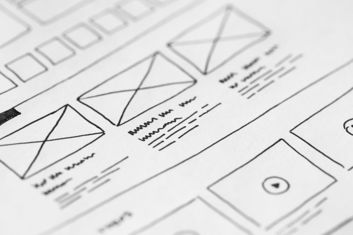
You do not need to hire anyone for most of this list. Here is the fastest path for the two most common platforms:
WordPress: Start with a modern block theme such as Twenty Twenty-Five, which supports grids, big type, and color palettes out of the box. Add trends with free plugins only when you need them: a dark-mode plugin for dark mode, an image-compression plugin for speed, and an accessibility checker for the basics. Avoid installing a new plugin for every trend — each one slows your site down.
Wix: Use the editor’s built-in tools first. Wix has grid layouts for bento grids, text themes for bold type, color palettes for warm colors, and an accessibility wizard. Search the template library for a template that already uses the trend you want, then change the colors and text to match your brand — that is faster than building the trend from scratch.
When to hire someone: Hire a designer for a full redesign, for custom 3D, or for a dark mode that has to work on every page. For one visual trend at a time, do it yourself. If a freelancer quotes you, ask for a fixed price for one trend, not an hourly rate for a whole redesign — it keeps the cost clear.
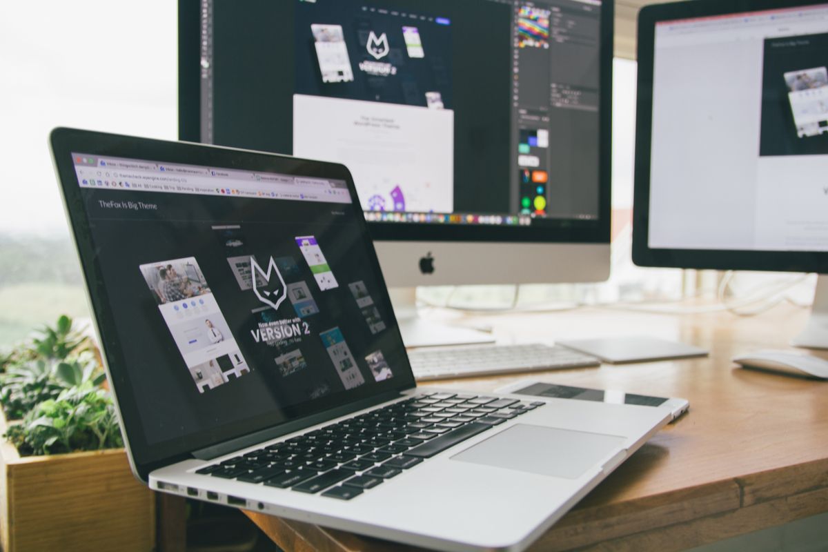
Yes. AI tools can build a basic page, but businesses still need designers for strategy, branding, and custom work that a template cannot do. What is changing is the job: designers now spend more time on user experience, accessibility, and AI-ready structure, and less time on routine layouts.
No — it is changing the work. AI can draft a layout or write starter code in seconds, but it cannot decide what a business should say, who its customers are, or how to build trust. Figma’s 2026 designer survey found most designers use AI daily and say it improves their work, not replaces it. The designers at risk are the ones who only do routine layout work that AI now does for free.
The 3-second rule says a visitor decides whether to stay or leave within about 3 seconds of a page loading. Google’s data backs the idea: 53% of mobile visitors leave a page that takes longer than 3 seconds to load. That is why the first screen of your site needs a clear headline, one main action, and a fast load — before any decoration.
The most common style in 2026 is warm and human: nature-inspired colors, big readable type, handmade details, and retro touches, mixed with clean bento grids and subtle motion. The exact style depends on the industry — fashion leans retro, wellness leans warm and natural, tech leans dark mode and bold type.
Generic AI-generated images, scroll-jacking, and cold grey corporate templates are fading. Full-page brutalism and heavy 3D on every page are also cooling off. The common thread: anything that looks the same on every site, slows the page down, or gets in the visitor’s way is on its way out.
The best web design trends of 2026 are the ones that make your site faster, clearer, and more human. Start with speed, accessibility, and one clear headline. Then add one visual trend that fits your customers — warm colors, bold type, or a bento grid — and test it on a phone before you commit. Skip the trends that slow your site down or make it harder to read. A small business does not need the flashiest site of 2026. It needs the site that loads fast, says clearly what it does, and makes it easy to get in touch.

Taylor Orlando is a content writer at Meregate covering websites, SEO, and AI. Taylor breaks down complex topics into simple, practical guides that help small businesses build better websites, rank higher on Google, and get real value from AI tools — no jargon, no fluff.
A favicon is the small icon that shows up next to your site name in a browser tab. This guide explains what it is, which size and format to use, and how to add one to WordPress.
Wix is a website builder that added selling; Shopify is a selling platform first. That one difference explains almost every trade-off in this comparison.

Is WordPress good for blogging in 2026? Yes, with caveats. See where it wins, where it falls short, and who should pick something else.