
Digital Marketing
Website Navigation Best Practices: A Simple Guide for Small Business (2026)
Website navigation best practices for small business: a simple 5–7 item menu, mobile and accessibility tips, SEO checks, and fixes for common mistakes.

 By Taylor Orlando
·November 5, 2026
Most website design mistakes are easy to spot once someone points them out — and expensive while they stay hidden. A visitor who cannot find your contact page, cannot read your text on a phone, or gives up on a slow page does not complain. They just leave, and you never know why. This guide covers the 12 website design mistakes to avoid, with a simple test and a free fix for each one, so you can check your own site in under an hour.
Last updated: November 2026
The mistake: opening a website builder and picking a template, colors, and sections before deciding what the page is for. The result is a homepage that tries to say everything and ends up saying nothing.
The test: write one sentence for each page — “This page exists so visitors will ___.” If you cannot finish the sentence, the page has no job yet.
The fix: sketch each page on paper first, even roughly. Put the most important thing at the top, one main action in the middle, and proof (reviews, photos, examples) before the footer. A rough sketch takes 15 minutes and saves hours of moving blocks around later.
The mistake: a homepage header that says “Welcome to our website” or “Quality you can trust” without saying what you do, who it is for, or what to do next. Visitors decide in seconds whether to stay, and vague words give them nothing to stay for.
The test: show your homepage to someone who has never seen your business and ask them, after five seconds, what you sell and what they should click. If they cannot answer, your header is failing.
The fix: rewrite the top of the page in plain words — what you do, who you help, and where you are, if location matters. Follow it with one clear button, such as “Get a quote” or “Book a call.” Put features second; the visitor’s problem comes first.
The mistake: a menu packed with a dozen items, clever labels nobody understands (“Solutions,” “Discover,” “Our World”), and pages buried three clicks deep. Visitors do not explore a confusing menu. They go back to Google.
The test: count your main menu items. If there are more than seven, or if a stranger cannot guess what is behind each label, your menu needs work.
The fix: keep five to seven items, use words visitors already use (“Services,” “Prices,” “Contact”), and put the most-wanted pages first. Move the rest into the footer or a sub-menu. Then watch someone use the menu without help — that five-minute test finds problems no checklist will.
The mistake: a page that explains everything and asks for nothing, or buttons that say “Click here” and “Submit” in pale colors that blend into the page. A visitor who is ready to act should never have to hunt for how.
The test: scroll through each main page and count the clear action buttons. If a page has none above the fold (the part you see before scrolling) and none at the end, it is leaking visitors.
The fix: give every important page one main action, written as a verb — “Book a free call,” “Get the price list,” “Order today.” Make the button stand out from the background, repeat it at the end of the page, and keep secondary links quieter so the main action wins.
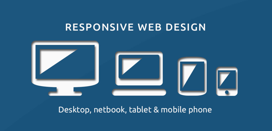
The mistake: building a site on a big screen, checking it only there, and never noticing that on a phone the text is tiny, buttons are too close together, the menu breaks, or visitors have to scroll sideways. Most small-business traffic now arrives on phones, so a desktop-only design is a mobile-broken design.
The test: open your site on a real phone, not just a preview window. Try to complete your main action — buy, book, or contact — with one thumb. Check these: can you read the text without zooming? Can you tap each button without hitting the one next to it? Does anything force sideways scrolling? Does the menu open and close cleanly? Does the form work without a keyboard covering the submit button?
The fix: design the mobile view first, then let the desktop view stretch out from it. Keep body text at 16 pixels or larger, give buttons breathing room, and use a simple menu on small screens. Test on a real phone after every big change — previews hide real problems.

The mistake: huge uncompressed photos, videos that auto-play, and a pile of plugins or widgets that load before the content does. Every extra second of waiting costs visitors, and slow pages also rank worse in search.
The test: run your homepage and your two most important pages through PageSpeed Insights, Google’s free speed checker, and note the Largest Contentful Paint number — that is roughly how long the main content takes to appear. Google treats 2.5 seconds or less as good.
The fix, in order: shrink images before you upload them (most photos do not need to be wider than 1600 pixels), turn on lazy loading so images below the fold load only when scrolled to, remove plugins and widgets you do not use, and pick a hosting plan that is not the cheapest shared option if your site is slow on every page. Re-test after each change so you know what actually helped.
The mistake: long paragraphs with no headings, no breaks, and no way to skim. Online, almost nobody reads word by word. People scan for the part that answers their question, and a wall of text tells them to look elsewhere.
The test: scroll a page quickly for ten seconds. If you cannot pick out the main points from headings and bold words alone, the page is not scannable.
The fix: break text into short paragraphs of two to four lines, add a descriptive heading every few paragraphs, and use bullet lists for steps, features, and options. Put the most important sentence first in each section. Cutting words is a design fix, not just an editing one.
The mistake: light gray text on a white background, small body text, or important words placed over a busy photo. It looks stylish in a mockup and unreadable in real life — especially for older visitors and anyone reading in sunlight.
The test: paste your text and background colors into the free WebAIM contrast checker. Normal-sized text should score a contrast ratio of at least 4.5 to 1, the level the Web Content Accessibility Guidelines (WCAG) set for readable text. Also read the page on your phone outdoors.
The fix: darken the text or lighten the background until it passes, keep body text at 16 pixels or above, and never put body text over a photo without a solid or darkened background behind it. If a designer argues for pale text, the contrast score settles the argument.
The mistake: five fonts, six colors, sliders, banners, chat boxes, and a popup before the visitor has read a word. Clutter makes every element fight for attention, so nothing gets it.
The test: screenshot your homepage and count fonts, colors, and moving elements. More than two font families or four main colors is a warning sign. Close every popup and ask whether the page got clearer — if yes, the popup was clutter.
The fix: pick two fonts (one for headings, one for body) and three or four colors, and use them everywhere. Give sections white space instead of borders and boxes. Show a popup only after the visitor has spent time on the page or is about to leave, never the second they arrive.
The mistake: giant photos that slow the page, generic stock photos that say nothing about your business, and images with no descriptive alt text, so search engines and screen readers cannot tell what they show.
The test: check your three biggest images — if any file is over 300 kilobytes, it probably needs compressing. Then turn images off in your browser or read the page with a screen reader: if the images add nothing, they are decoration, not content.
The fix: compress every image before upload, use real photos of your work, team, or products where you can, and write alt text that describes what the image shows (“plumber fixing a kitchen sink,” not “image1”). Good alt text helps both accessibility and search.
The mistake: a beautiful page with a title tag that just says “Home,” headings used for size instead of structure, and no words on the page that match what customers actually search for. Search engines read structure, not beauty.
The test: check each important page — does its browser title describe the page in plain words? Is there one main heading that says what the page is about, with subheadings in order below it? Does the first paragraph say what the page covers?
The fix: write a unique, plain-word title for every page, use headings in order (main heading first, then subheadings, never skipping levels for style), and put your main topic in the first paragraph naturally. These are design decisions, and fixing them later means rebuilding pages you already built.
The mistake: launching a site and never checking whether everyone can use it — or never testing it with real people at all. Keyboard users, screen-reader users, and visitors with shaky hands or poor eyesight hit barriers that mouse users never see, and a site that is never re-checked quietly goes stale.
The test: unplug your mouse and try to reach your main action using only the Tab key — you should always see where you are on the page, and never get stuck. Then submit a form with a missing field: does the error message say exactly what to fix, in words, not just red color? Finally, ask three real customers to complete your main task while you watch silently.
The fix: label every form field, make sure buttons and links are reachable and visible by keyboard, add captions or transcripts to videos, and repeat the real-person test every few months and after every redesign. Accessibility fixes help everyone: clearer labels, bigger targets, and better contrast make the site easier for every visitor.
You do not need a redesign or a big budget to fix most of these. Start with the fixes that cost nothing:
Only then spend money — on better hosting if speed is still bad, on real photography if stock photos are hurting trust, or on a designer for a full rebuild if the structure itself is wrong. Fixing in this order means the free wins come first and the paid ones solve real, measured problems.
Score your homepage and one key service page. Give one point for each “yes.” A score below 7 means the page needs work before anything else.
Confusing navigation, weak or missing calls to action, poor mobile experience, slow pages, hard-to-read text, cluttered layouts, and missing SEO basics show up on almost every list. Most of them are cheap to fix once you test for them.
Plan each page around one job, test on a real phone and with a keyboard, check speed and contrast with free tools, and watch real visitors use the site. A short test beats a long opinion about what looks good.
A poorly designed site makes visitors work: they cannot tell what you do, cannot find what they need, cannot read the text, or cannot complete the action they came for. Good design is mostly about removing that work.
Most visitors now arrive on phones, and Google ranks pages largely on their mobile version. A site that only works well on a desktop is broken for most of its audience.
Yes. Slow pages, poor mobile experience, missing page titles, broken heading structure, and missing alt text all make it harder for search engines to understand and rank your pages — even when the content itself is good.
Vague headers, no clear next step, and a site that was never tested on a phone. Those three alone lose more customers than any color or font choice, and all three are free to fix.

Taylor Orlando is a content writer at Meregate covering websites, SEO, and AI. Taylor breaks down complex topics into simple, practical guides that help small businesses build better websites, rank higher on Google, and get real value from AI tools — no jargon, no fluff.
Website navigation best practices for small business: a simple 5–7 item menu, mobile and accessibility tips, SEO checks, and fixes for common mistakes.
Learn how to create a landing page with no coding: pick a goal, write copy that converts, build it free, and test it before you publish.

Wix vs Squarespace in 2026: Wix wins on flexibility and a free plan, Squarespace wins on design polish and simplicity. Full comparison on price, SEO, and selling.