
Digital Marketing
Wix vs Squarespace: Which Website Builder Is Better in 2026?
Wix vs Squarespace in 2026: Wix wins on flexibility and a free plan, Squarespace wins on design polish and simplicity. Full comparison on price, SEO, and selling.

 By Taylor Orlando
·November 2, 2026
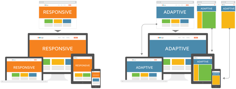
A landing page is a single web page built around one job: getting the visitor to take one clear action. That action might be signing up for a free guide, joining a waitlist, booking a call, or buying a product. Unlike a homepage, which gives visitors many links and many exits, a landing page keeps the focus on one thing.
In this guide, you will learn how to create a landing page step by step, even if you have never built a web page before. You do not need to know how to code, and you do not need a full website. You can build a working page in an afternoon with a free tool.
Think of it this way: a homepage is like a shop front with many doors. A landing page is like a single counter with one clear offer. Someone clicks your ad, your social media post, or your email link, and they land on a page that matches what they clicked. That match is what makes landing pages work.
Here is the key difference:
Common types of landing pages include lead generation pages (collect an email in exchange for something free), sales pages (sell one product), waitlist pages (build interest before a launch), and event pages (get sign-ups for a webinar or workshop).
Most weak landing pages fail before anyone opens a builder. They fail because the goal is unclear. Before you touch a template, write down short answers to these five questions:
| Question | Your answer (keep it to one line) |
|---|---|
| 1. What is the ONE action you want? | Example: “Sign up for the free 7-day email course.” |
| 2. Who is this page for? | Example: “New bakery owners who need their first customers.” |
| 3. What exactly do they get? | Example: “A free checklist plus one email a day for 7 days.” |
| 4. What type of page is it? | Lead generation, sales, waitlist, or event sign-up. |
| 5. Where will visitors come from? | Instagram bio, Google search, an email, or a paid ad. |
If you cannot answer question 1 in one sentence, stop and fix that first. Everything else on the page — the headline, the images, the button — should point back to that one action. This also matters for message match: the words on your page should match the words in the ad or post that sent people there. If your ad promises a free checklist and the page talks about your company history, visitors will leave.
Almost every strong landing page has the same building blocks, in roughly this order:
Use your answers from the five questions above. Write the goal at the top of a blank document. If you catch yourself adding a second goal (“and also sell the course, and also grow Instagram”), cut it. One page, one job.
You do not need a website to have a landing page. Most builders let you publish on their own subdomain for free, such as yournamebuilder.com. Here are beginner-friendly starting points:
| Builder | Free plan notes | Best for |
|---|---|---|
| Canva | Free to design and publish on a Canva subdomain | Simple pages, fast setup, no learning curve |
| Wix | Free plan with a Wix subdomain and Wix branding | Beginners who want many templates |
| Carrd | Free plan covers simple one-page sites | Clean, minimal one-page sites |
| Mailchimp or HubSpot | Free landing pages tied to their email tools | Pages whose main job is collecting emails |
Free plans have limits: a builder subdomain instead of your own domain, builder branding on the page, and sometimes a cap on pages or visitors. That is fine for a first page. You can add a custom domain later, usually for a small yearly fee, when the page starts working.
Choose a template made for your page type — a lead generation template for email sign-ups, a sales template for a product. Do not pick a template just because it looks pretty. A template built for your goal already has the right sections in the right order, which saves you from designing from scratch.
The headline does most of the work. If visitors do not understand the offer in a few seconds, they leave. Try one of these simple formulas and fill in the blanks:
Write five headlines, then pick the clearest one — not the cleverest. Clear beats clever on a landing page.
Use this simple skeleton for the rest of the page. It covers what most competitors skip: the exact words, not just the sections.
Every image should help the visitor understand the offer. A photo of the finished result, a short video of the product in use, or a screenshot of the guide all work. Stock photos that could belong to any business do not. Keep images small in file size so the page loads fast, and write a short description (alt text) for each image so search engines and screen readers understand it.
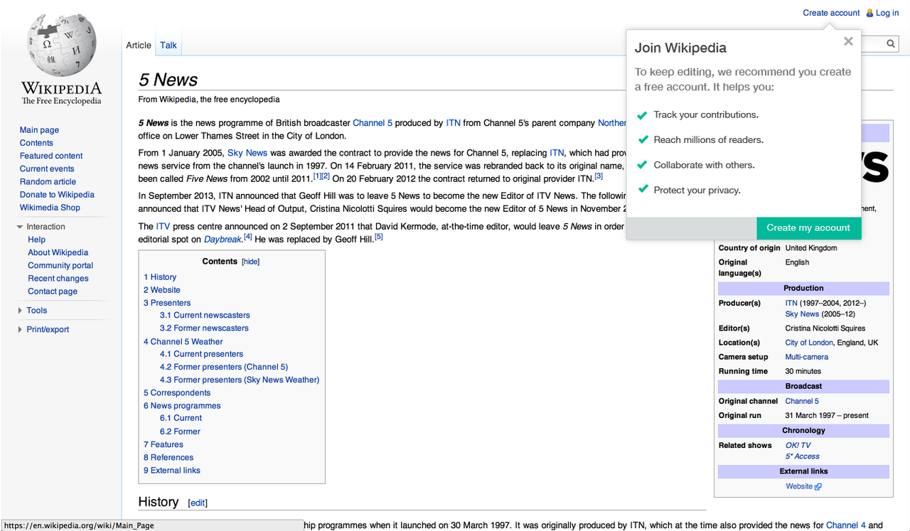
Ask for as little as possible. For a free guide or waitlist, a name and email address are enough. Every extra field lowers sign-ups, so only add a field if you will actually use the answer. Then test the form yourself: fill it in with your own email and check that you receive what was promised. A form that silently fails wastes every visitor it attracts.
One more rule: one page, one main button. You can repeat the same button further down a long page, but do not add a second, different action (“Buy now” plus “Read our blog” plus “Follow us”). Each extra choice costs you sign-ups.
Most of your visitors will likely see the page on a phone first. Open the page on your own phone and check:
A page that looks great on a laptop but breaks on a phone will lose most of its visitors. Fix mobile first, then polish the desktop view.
Hit publish, then share the link where your audience already is: your social media bio, an email to your list, or a post in a community you are part of. Then give the page a little traffic before you judge it. Ten visitors tell you almost nothing; a few hundred start to show a pattern. Write down two numbers from the start: visitors and sign-ups. Sign-ups divided by visitors, times 100, is your conversion rate — the one number that tells you if the page works.
One of the most common questions is also the one most guides avoid. Here is an honest breakdown. Prices change, so treat these as rough ranges and check the builder’s own pricing page before you pay.
| Option | Rough cost | Notes |
|---|---|---|
| DIY with a free builder plan | $0 | Builder subdomain, builder branding, basic features |
| DIY with a paid builder plan | About $10–$30 per month | Removes branding, allows a custom domain, more features |
| Custom domain name | About $10–$15 per year | Optional at first; buy it when the page works |
| Email tool (if not included) | Free up to a subscriber limit, then paid tiers | Needed if your page collects emails at scale |
| Hiring a freelancer or designer | A few hundred to a few thousand dollars | Worth it once you know the offer converts; overkill for a first test |
The cheapest way to start is free, and for a first page that is the right choice. Spend money only after the free page proves that people want the offer.
Once the page is live, resist the urge to change everything at once. Pick one thing to test first — usually the headline, since it is the first thing visitors read. Run the test like this:
If almost nobody signs up, the problem is usually one of three things: the wrong audience saw the page, the headline promises something the page does not deliver, or the form asks for too much. Fix those before you redesign anything else. You can also use free tools such as PageSpeed Insights to check how fast the page loads and what slows it down.
Yes, with a catch. AI tools can draft headlines, write a first version of your copy, and some builders can generate a full page from a short prompt. That is a useful starting point, but do not publish AI output untouched. Check every claim, fix anything generic, and rewrite the copy in your own voice. Visitors can spot generic AI text, and it rarely speaks to a real audience’s real worries. Use AI to get started faster, then edit like a human who knows the customer.
Yes. Builders like Canva, Wix, Carrd, and Mailchimp let you publish a page on their subdomain without owning a website or a domain name. You can add a custom domain later if you want one.
Yes. Free plans from builders such as Canva and Wix cover a basic page, though they usually add builder branding and use a builder subdomain. Paid plans remove those limits and add features like A/B testing.
It depends on your goal. For a simple free page, Canva or Carrd are the easiest starting points. For email collection tied to a newsletter, Mailchimp or HubSpot make sense. For long-term testing and many pages, a dedicated builder like Unbounce or Instapage is worth comparing once you outgrow a free plan.
A homepage introduces your whole business and links to many pages. A landing page focuses on one offer and one action for one audience, with no navigation pulling visitors away.
No, not to start. A free builder subdomain works fine for testing. Buy a custom domain when the page proves itself or when you want a more professional address for ads.
A clear headline, a short subheadline, a visual that shows the offer, benefit bullets, some social proof, one form with one clear button, a short FAQ, and a thank-you step after sign-up.
With a template and your five planning answers ready, a simple page takes one to three hours. Most of that time should go to the headline and the copy, not to picking colors.
Yes. You can pick a landing page template in Canva, edit the text and images, and publish it on a free Canva subdomain. For details, see Canva’s landing page builder.
A good landing page is not about fancy design. It is about one clear promise, made to the right people, with one easy action to take. Answer the five planning questions, fill in the copy skeleton, check the page on your phone, and test the form before you share the link. Then let real visitors tell you what to improve next.
Last updated: November 2026

Taylor Orlando is a content writer at Meregate covering websites, SEO, and AI. Taylor breaks down complex topics into simple, practical guides that help small businesses build better websites, rank higher on Google, and get real value from AI tools — no jargon, no fluff.
Wix vs Squarespace in 2026: Wix wins on flexibility and a free plan, Squarespace wins on design polish and simplicity. Full comparison on price, SEO, and selling.
Mailchimp is a wide marketing platform, AWeber is a focused email tool. Compare pricing, automation, deliverability, and support to pick the right one.

Mailchimp vs Brevo compared on pricing, free plans, automation, ecommerce and SMS. See which email tool is cheaper for your list size and send frequency.