Digital Marketing
How to Create a Landing Page: A Simple Step-by-Step Guide (2026)
Learn how to create a landing page with no coding: pick a goal, write copy that converts, build it free, and test it before you publish.

 By Taylor Orlando
·November 3, 2026

Website navigation best practices are simple: help every visitor find what they need in a few seconds, without thinking hard. When your menu is clear, people stay longer, contact you more, and buy more. When it is confusing, they leave — often without telling you why.
This guide is for small business owners, not web designers. You will get a sample menu you can copy, 12 practical tips, a mobile checklist, a plain-language accessibility checklist, and a mistakes-and-fixes table. No jargon, no redesign needed.
Last updated: November 2026
Website navigation is the set of links that help visitors move around your site. The main menu at the top is the most important part, but navigation also includes the footer links at the bottom, breadcrumbs (the small “Home > Services > Plumbing” trail), buttons inside pages, and the search box.
Think of it like signs in a shop. A good shop puts clear signs where people expect them: entrance, aisles, and checkout. A bad shop hides the signs, uses odd names for aisles, or changes the layout on every floor. Your website works the same way.
Most small business sites only need 5 to 7 items in the main menu. Here is a full example for a local bakery. Notice how each label says exactly what the page is about.
Main menu (desktop): Home | About Us | Menu & Prices | Order Online | Catering | Reviews | Contact
Dropdown under “Menu & Prices”: Breads | Cakes | Pastries | Gluten-Free Options
Footer: Home, About Us, Menu & Prices, Order Online, Catering, Reviews, Contact — plus Privacy Policy, Terms, Delivery Areas, and opening hours.
Mobile menu: the same 7 items, stacked in one list behind a hamburger (three-line) button, with a large “Order Online” button at the top and a tappable phone number.
That is it. No “Welcome,” no “Our World,” no “Solutions” — words that sound nice but tell visitors nothing. If a label does not make sense to a stranger in two seconds, change it.
Seven is the practical limit, and five is often better. Research shared in Google’s AI Overview and by usability experts points to a 4–7 item range, and every extra item makes the rest harder to scan. If you have more pages, group them: put related pages under one clear dropdown, or move less-used pages to the footer.
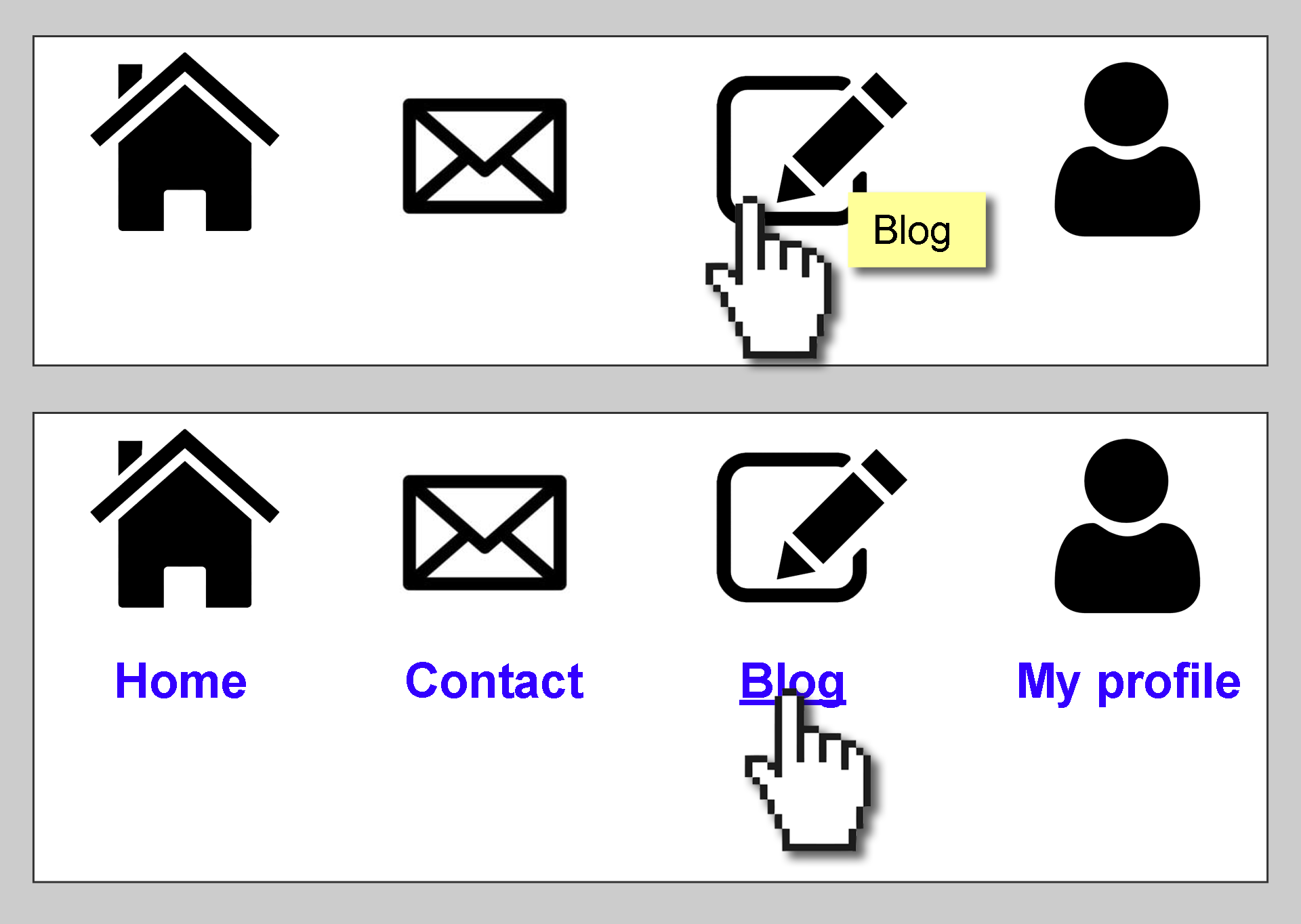
Use the words your customers use. “Plumbing Services” beats “Solutions.” “Prices” beats “Investment.” “Contact Us” beats “Let’s Talk.” A good test: if you covered up the page and only showed the label, would a visitor know what they will find? If not, rewrite it.
People notice the first and last items in a menu most. Put a high-traffic page first (often Services or Shop) and your main action last, as a button — for example, “Get a Quote,” “Book Now,” or “Order Online.” Keep the order the same on every page.
Visitors expect to click your logo to go home. Make sure it works on every page, including blog posts and checkout pages. This is such a basic habit that people only notice it when it is missing.
Do not move the menu, rename items, or hide links on some pages. Consistency builds trust: once a visitor learns where things are, they should not have to relearn it. The same goes for the footer — keep it the same site-wide.
Your header should have one button, not three. If everything is a button, nothing stands out. Pick the single action that matters most — call, quote, booking, or order — and make it a button. Put social media icons in the footer instead, so they do not pull visitors away before they contact you.
One level of dropdown is fine. Two levels are risky on mobile. Three levels are a maze. If your dropdown needs more than about 10 items, split it into groups with headings, or turn it into a mega menu with clear sections. Never hide a key page — like pricing or contact — two levels deep.
Highlight the current page in the menu, and use breadcrumbs on deeper pages (“Home > Services > Roof Repair”). This sounds small, but it stops people from feeling lost, and it helps them jump back one step instead of starting over.
If “Services” has a dropdown, the “Services” link itself should still open a real page — ideally an overview of all services. Visitors on touchscreens often tap the parent item first, and a dead link feels broken. Research from the Baymard Institute flags non-clickable headers as a common navigation pitfall.
If you have more than 30 pages, add a search box in the header. Navigation works best for browsing; search works best when someone already knows what they want. On a small 5-page site, search is optional — a clear menu is enough.
The footer is not a junk drawer. It is where visitors look for contact details, hours, delivery areas, policies, and pages that did not fit the main menu. Organize it in columns with headings (Company, Services, Help, Contact) instead of one long list of links.
You know your site too well to judge it fairly. Ask three people who have never seen it to find your prices and your contact page, and time them. If anyone takes more than 30 seconds, or clicks the wrong link first, your menu needs work. Cheap tests like this catch more problems than any tool.
More than half of most small business traffic comes from phones, so the mobile menu deserves its own check. Here is the short version:

Accessible navigation helps everyone — including people who use keyboards or screen readers, and older visitors. You do not need to be a coder to check the basics:
Fixing these items is not only good practice — it also widens your audience and reduces the chance of complaints about your site being hard to use.
Navigation is not just design. It shapes how Google finds and ranks your pages:
The fix is usually simple: fewer, clearer links, with your key service pages in the main menu and everything else in the footer or on a sitemap page.
| Mistake | Why it hurts | Quick fix |
|---|---|---|
| Vague labels like “Solutions” or “Discover” | Visitors cannot guess what is behind the link | Rename it to the service or topic itself |
| 12+ items in the main menu | Nothing stands out; scanning gets slow | Cut to 5–7; move the rest to the footer or dropdowns |
| Contact hidden in a dropdown | Ready-to-buy visitors give up | Put Contact in the main menu and footer |
| Non-clickable parent items | Touchscreen users hit a dead end | Give every parent a real overview page |
| Social icons in the header | Visitors leave before contacting you | Move social icons to the footer |
| Different menu on mobile | Visitors get confused switching devices | Same items, same order, stacked list |
| Tiny, crowded tap targets | Wrong taps frustrate phone users | 44px targets with space between links |
| No footer navigation | Visitors at the bottom have nowhere to go | Add an organized footer with headings |
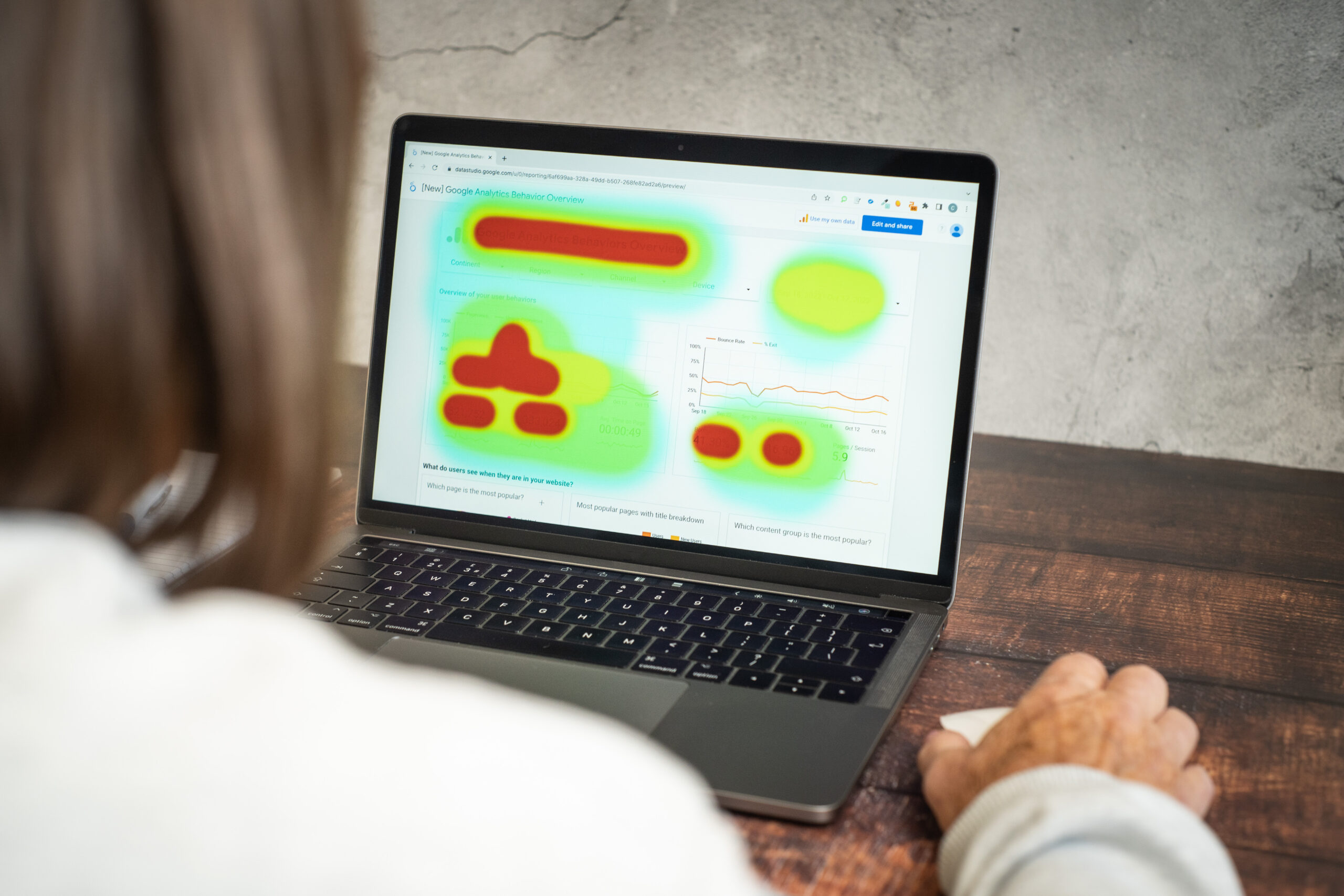
You do not need paid tools to test navigation. Try these four cheap methods:
Repeat the find-it test after every change. Small fixes — one label, one order swap — often beat a full redesign.
Five to seven main items is the safe range for most small business sites. Fewer is fine if your site is small. More than seven usually means some pages belong in a dropdown, in the footer, or on a single overview page.
Good examples share the same traits: short labels, a clear order, one header button, and a useful footer. A bakery menu like the sample above is a good model — not because it is fancy, but because a stranger can use it in seconds. The Baymard Institute’s navigation research shows the same patterns in larger stores, backed by thousands of usability tests.
Usually no. On desktop screens you have room to show the menu, and hiding it makes visitors work harder. Save the hamburger for phones and small tablets, where space is tight and the pattern is expected.
Yes. Clear navigation helps search engines find your pages, understand what they are about, and pass ranking signals to the pages that matter. Buried pages, vague labels, and orphan pages with no links all weaken that signal.
Navigation is what visitors use to move around your site. A sitemap is a full list of your pages — useful for search engines and for visitors who want an overview, but not a replacement for a clear menu.
Good navigation is quiet. Nobody praises a menu that works — they just stay, find what they need, and contact you. That silence is the goal. Start with the sample menu above, fix the mistakes in the table, and test with real people before you spend money on a redesign.

Taylor Orlando is a content writer at Meregate covering websites, SEO, and AI. Taylor breaks down complex topics into simple, practical guides that help small businesses build better websites, rank higher on Google, and get real value from AI tools — no jargon, no fluff.
Learn how to create a landing page with no coding: pick a goal, write copy that converts, build it free, and test it before you publish.

Wix vs Squarespace in 2026: Wix wins on flexibility and a free plan, Squarespace wins on design polish and simplicity. Full comparison on price, SEO, and selling.
Mailchimp is a wide marketing platform, AWeber is a focused email tool. Compare pricing, automation, deliverability, and support to pick the right one.