Home › Digital Marketing › Website Design Best Practices: 14 Tips for Small Business (2026)
Website Design Best Practices: 14 Tips for Small Business (2026)
By Taylor Orlando·November 9, 2026
Good website design is not about looking fancy. It is about helping visitors find what they need, trust your business, and take the next step — whether that is calling you, buying something, or filling out a form. This guide covers 14 website design best practices that work for small businesses, plus what good design costs, free tools you can use, common mistakes to avoid, and a checklist you can use before you launch.
Your website is often the first thing a customer sees. If it loads slowly, looks messy on a phone, or hides the contact button, people leave — and they rarely come back. Google research found that 53% of mobile visits are abandoned when a page takes more than 3 seconds to load. A review of 500 homepages by Orbit Media found that 67% had no clear call to action and 72% showed no social proof, like reviews or testimonials. That is a lot of lost business from simple, fixable problems.
The good news: you do not need a big budget or a design degree. The 14 practices below cover the basics that make the biggest difference.
Source: Wikimedia Commons
1. Give Every Page One Clear Goal
Before you design anything, decide what each page should do. A homepage should explain what you do and point people to the next step. A service page should explain one service and ask visitors to get a quote. A contact page should make it easy to reach you.
When a page tries to do five things at once, visitors do none of them. One page, one job. If you are not sure what a page’s job is, it probably needs a rewrite before it needs a redesign.
2. Put Your Value Proposition Above the Fold
“Above the fold” means the part of the page people see without scrolling. In the first few seconds, a visitor should be able to answer three questions: What does this business do? Who is it for? What should I do next?
A short headline that says what you do beats a clever slogan every time. “Family dentist in Austin — same-week appointments” tells a visitor far more than “Smiles that shine.” Put your main message and your main button in that first screen.
3. Keep Your Branding Consistent
Pick two or three colors, one or two fonts, and one style of photos, then use them on every page. Consistency makes your site look professional and helps people remember you.
Use your logo in the top-left corner of every page — that is where people expect it. Keep buttons the same color and shape across the site so visitors learn what is clickable. Small details like this add up to trust.
4. Keep Navigation Simple
Most visitors decide in seconds whether to stay. If they cannot find what they need, they leave. Keep your main menu short — five to seven items is a good limit — and use plain words people actually search for, like “Services,” “Pricing,” and “Contact.”
Avoid vague labels like “Solutions” or “Discover.” The Orbit Media review found that 70% of homepages used generic navigation labels. Be specific: “Roof Repair” is better than “Our Services” if roof repair is what you sell. Add a search box if your site has more than 20 pages.
5. Use a Clear Visual Hierarchy
Visual hierarchy just means: the most important thing on the page should look the most important. Your headline should be the biggest text. Your main button should stand out from everything around it. Less important details should be smaller and quieter.
People scan pages in rough patterns — across the top, then down the left side — so put key points where eyes naturally go. Break long pages into short sections with clear headings. If everything on a page shouts, nothing gets heard.
6. Leave Plenty of White Space
White space is the empty space between text, images, and sections. It is not wasted space — it is what makes a page easy to read. Crowded pages feel hard to use, even if visitors cannot say why.
Give paragraphs room to breathe, add space between sections, and do not fill every corner. A clean page with fewer elements usually sells better than a busy one.
7. Make Text Easy to Read
Use a font size of at least 16 pixels for body text. Keep lines short — about 50 to 75 characters per line is comfortable to read. Use dark text on a light background, and keep a strong contrast between text and background.
Break text into short paragraphs and use bullet points for lists. Most people scan a page before they read it, so headings and bold lead-ins help them find what matters. Avoid light gray text on a white background — it is hard to read for everyone, and nearly impossible for people with poor eyesight.
8. Make Every Call to Action Clear
A call to action (CTA) is the button or link that tells visitors what to do next: “Get a Free Quote,” “Book an Appointment,” “Call Now.” Every important page needs at least one, and it should be easy to spot.
Use action words and say what happens next. “Get My Free Quote” works better than “Submit.” Make the button big enough to tap on a phone, give it a color that stands out from the rest of the page, and repeat it further down long pages. Remember, two out of three homepages in the Orbit Media review had no CTA at all — just adding one puts you ahead.
9. Design for Mobile First
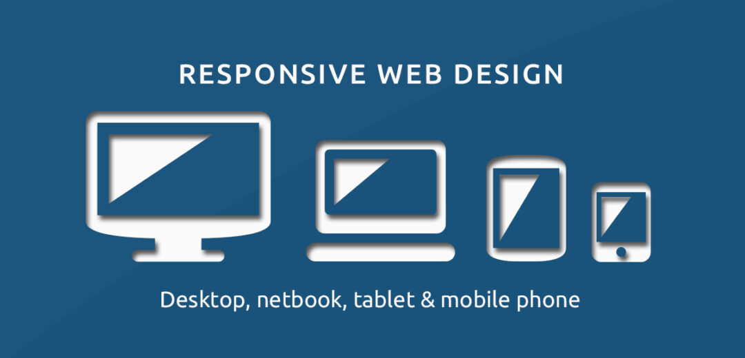
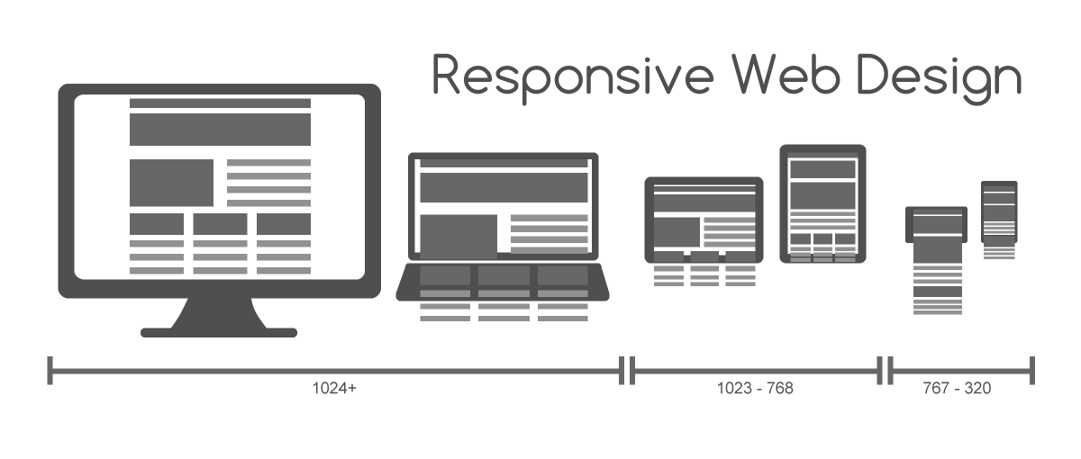
Most of your visitors are on phones. Design the mobile version first, then expand it for larger screens — not the other way around. A site that looks great on a desktop but breaks on a phone is a site that loses customers.
Use this mobile checklist:
Make buttons and links at least 44 by 44 pixels, so they are easy to tap.
Keep the phone number or main button stuck to the bottom of the screen on mobile, where thumbs can reach it.
Use a simple menu (the three-line “hamburger” icon) instead of squeezing a full menu onto a small screen.
Make forms short — ask for name, phone, and message first, and nothing else unless you truly need it.
Test on a real phone, not just by shrinking your browser window. Check that text is readable without zooming and that nothing runs off the edge of the screen.
Source: Wikimedia Commons
10. Make Pages Load Fast
Speed is part of design. A slow site feels broken, and Google uses speed as a ranking factor. Aim for these targets from Google’s Core Web Vitals: your main content should appear in under 2.5 seconds, and the page should stop shifting around while it loads.
Look at the mobile score first — that is what most visitors experience.
Fix the top issue it lists. The most common fixes are: shrink large images before uploading them, use a modern image format like WebP, and turn on lazy loading so images below the fold load only when someone scrolls to them.
Test again after each fix. Small changes add up fast.
Other quick wins: keep the number of fonts and plugins low, use a caching plugin if you run WordPress, and pick a hosting plan that is not the cheapest one you can find — slow hosting makes everything else pointless.
11. Make Your Site Accessible to Everyone
Accessible design means people with poor eyesight, hearing problems, or limited movement can still use your site. It is the right thing to do, it helps your SEO, and in the US it can reduce the risk of an accessibility lawsuit against your business.
Start with this plain-English checklist, based on the WCAG 2.2 AA standard — the accessibility standard most US courts and big companies use:
Text contrast of at least 4.5 to 1 for normal text, and 3 to 1 for large text. You can check any color pair free with the WebAIM Contrast Checker.
Every image gets alt text that describes what the image shows.
Every form field has a visible label, not just placeholder text that disappears when you type.
Your whole site can be used with a keyboard alone — press Tab and check that you can see where you are on the page.
Do not use color alone to show meaning. A form error should say “Please enter a valid email,” not just turn the box red.
Let users pause or stop any video or animation that plays on its own.
12. Add Trust Signals
People buy from businesses they trust. A new visitor has no reason to trust you yet, so show proof. Add real customer reviews, short testimonials with a name and town, logos of clients or groups you belong to, and any guarantees you offer.
Show your prices or at least a starting price — hiding prices makes people suspicious. Put your phone number, address, and business hours where they are easy to find, and add a real photo of your team or your shop instead of only stock photos. These small signals make a big difference, and most small business sites skip them.
13. Build SEO Into the Design
Good design and good SEO go together. Search engines need to understand your pages, and so do visitors. A few basics cover most of it:
Every page gets one clear title tag that describes what the page is about (under 60 characters).
Use headings in order — one main topic, then subheadings — instead of making text big just by bolding it.
Use short, readable page addresses, like /roof-repair/ instead of /page?id=47.
Write a short meta description for each page (around 155 characters) that tells searchers why they should click.
Make sure Google can find your pages: submit a sitemap through Google Search Console and fix broken links.
14. Keep the Site Secure and Maintained
A good design does not help if the site gets hacked or breaks. Use an SSL certificate (the padlock in the address bar — most hosts include it free now), keep your platform, theme, and plugins updated, and use strong passwords with two-factor authentication on your admin account.
Set up automatic backups so you can restore the site if something goes wrong, and check the site once a month: click your main links, test the contact form, and look for pages that load slowly or show errors. A site is never “finished” — plan a small amount of time each month to keep it healthy.
How Much Does Good Web Design Cost?
Prices vary by location and by who does the work, but these typical US ranges will help you plan a budget:
Option
Typical cost
Best for
DIY website builder (Wix, Squarespace, WordPress)
$0–$30 per month
Simple sites, tight budgets, owners who will update it themselves
Freelance designer
$500–$5,000 one-time
Small businesses that want a custom look without agency prices
Design agency
$3,000–$15,000+ one-time
Bigger sites, online stores, businesses that need strategy and copy too
Domain name
$10–$15 per year
Every site
Hosting
$3–$30 per month
Every site — avoid the cheapest plan if speed matters
Maintenance (updates, backups, small fixes)
$50–$200 per month
Any site you do not want to maintain yourself
A realistic first-year budget for a small business site is roughly $300 to $1,000 if you build it yourself, and $2,000 to $8,000 if you hire a freelancer. Get quotes in writing, ask what is included (content, images, SEO setup, training), and find out who owns the site and the domain when the work is done.
Free Tools That Help With Web Design
Tool
What it does
Cost
PageSpeed Insights
Tests your page speed and lists what to fix
Free
Google Search Console
Shows how Google sees your site and flags errors
Free
Google Analytics
Shows where visitors come from and what they do
Free
WAVE
Checks a page for accessibility problems
Free
WebAIM Contrast Checker
Checks if your text colors pass contrast rules
Free
TinyPNG
Shrinks images so pages load faster
Free
Figma
Lets you sketch page layouts before you build them
Free plan
10 Common Website Design Mistakes to Avoid
No clear call to action. Visitors do not know what to do next.
Too much text on the homepage. People scan — long blocks of text get skipped.
Tiny buttons and links on mobile. If people cannot tap it, they cannot buy from you.
Slow pages. Big, uncompressed images are the usual cause.
Stock photos everywhere. Real photos of your work build more trust than generic images.
Pop-ups that appear right away. Let people see your site before asking for their email.
Auto-playing video or music. It annoys visitors and can cause problems for people with motion sensitivity.
Generic menu labels. “Services” tells people nothing; name the actual service.
No contact details on every page. Your phone number should never be hard to find.
Never updating the site. Old prices, dead links, and a 2021 copyright notice make a business look closed.
Website Design Checklist Before You Launch
Run through this list before any new page — or a full redesign — goes live:
The main message and main button are visible without scrolling.
The menu has seven items or fewer, with plain, specific labels.
Text is at least 16 pixels, with strong contrast against the background.
Every image has alt text.
Buttons and links are at least 44 by 44 pixels on mobile.
The site works on a real phone — no sideways scrolling, no cut-off text.
Pages load in under 2.5 seconds on mobile (check with PageSpeed Insights).
The contact form works and sends mail to the right inbox.
Every page has a title tag and a meta description.
SSL is on (padlock in the address bar).
Analytics and Search Console are set up.
Test the site with a keyboard only — you can reach every link and button.
Proofread every page. Ask one person who has never seen the site to try it and tell you what confused them.
Frequently Asked Questions
What are the most important web design principles?
Keep it simple, make it fast, design for mobile first, and make the next step obvious. Everything else — colors, fonts, images — supports those four things.
How much does website design cost for a small business?
A DIY site costs roughly $300 to $1,000 in the first year. A freelancer usually charges $500 to $5,000 for a small business site, and an agency $3,000 to $15,000 or more. Add hosting, a domain, and ongoing maintenance to the total.
What makes a website look professional?
Consistent colors and fonts, real photos, clear headings, short paragraphs, and no errors — no broken links, no blurry images, no outdated information. Professional is mostly about care and consistency, not expensive effects.
How do I know if my website design is good?
Watch real people use it. Ask five people to find your prices and contact you, and watch where they struggle. Check your analytics too: if most mobile visitors leave in under 10 seconds, something on the page is pushing them away.
Is web design different from web development?
Yes. Web design is about how the site looks and how people use it — layout, colors, text, and buttons. Web development is about building it — the code, the database, and how the site works behind the scenes. Small projects often need a bit of both.
How often should I redesign my website?
Most small business sites need a fresh look every 3 to 5 years, or sooner if the site is slow, looks bad on phones, or no longer matches what the business offers. Small updates — new photos, fresh text, fixed links — should happen all year, not only during a redesign.
The Bottom Line
Good website design is mostly common sense done well: one goal per page, a clear message at the top, simple navigation, fast loading, readable text, and a button that is easy to find and tap. Start with the checklist above, fix the biggest problems first, and test with real people. You do not need to get everything perfect on day one — but every fix on this list makes your site easier to use and more likely to turn visitors into customers.
Taylor Orlando is a content writer at Meregate covering websites, SEO, and AI. Taylor breaks down complex topics into simple, practical guides that help small businesses build better websites, rank higher on Google, and get real value from AI tools — no jargon, no fluff.
An ecommerce website costs $500–$1,500 in the first year if you build it yourself, or $5,000–$25,000 with an agency — plus payment fees on every sale. Here is the full breakdown.
You don't need to pay to build a good landing page. These eight builders have real free plans — here is what each one includes and where it falls short.
A step-by-step Google Ads for doctors SEO outline for medical practices: local listings, service pages, campaign structure, budget, and HIPAA-safe tracking.